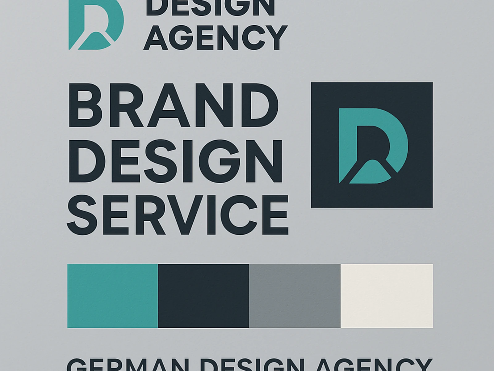
A logo is the most visible part of a brand system, but it is not the most important part. The most important part is the system around it: the colour palette that makes anything you produce immediately recognisable, the typography rules that create consistent hierarchy, the photography direction that makes your social posts look like they came from the same company.
Brand systems fail most often because the logo is designed without thinking about context. We start with context. What surfaces will this identity appear on? What does the business need to communicate? What tone? The logo is designed to work in those contexts.
We do not produce a logo and call it a brand. The deliverable is a complete system: logo variants, colour specifications, typographic scale, spacing rules, and a guidelines document that anyone in your organisation can use to maintain consistency.
For Dortmund and the wider NRW region, we have worked with businesses ranging from early-stage startups to established mid-sized companies. The brand work looks different for each one because the brief is different for each one.
What is included
What a client says
"Our brand finally says what we always meant it to say. The work was done clearly and on schedule."