Design systems exist to solve a specific problem: when multiple people are building the same product, they make different decisions. The button looks slightly different on the signup page than it does in the dashboard. The spacing feels inconsistent between features. The loading state was designed by three different people and it shows.
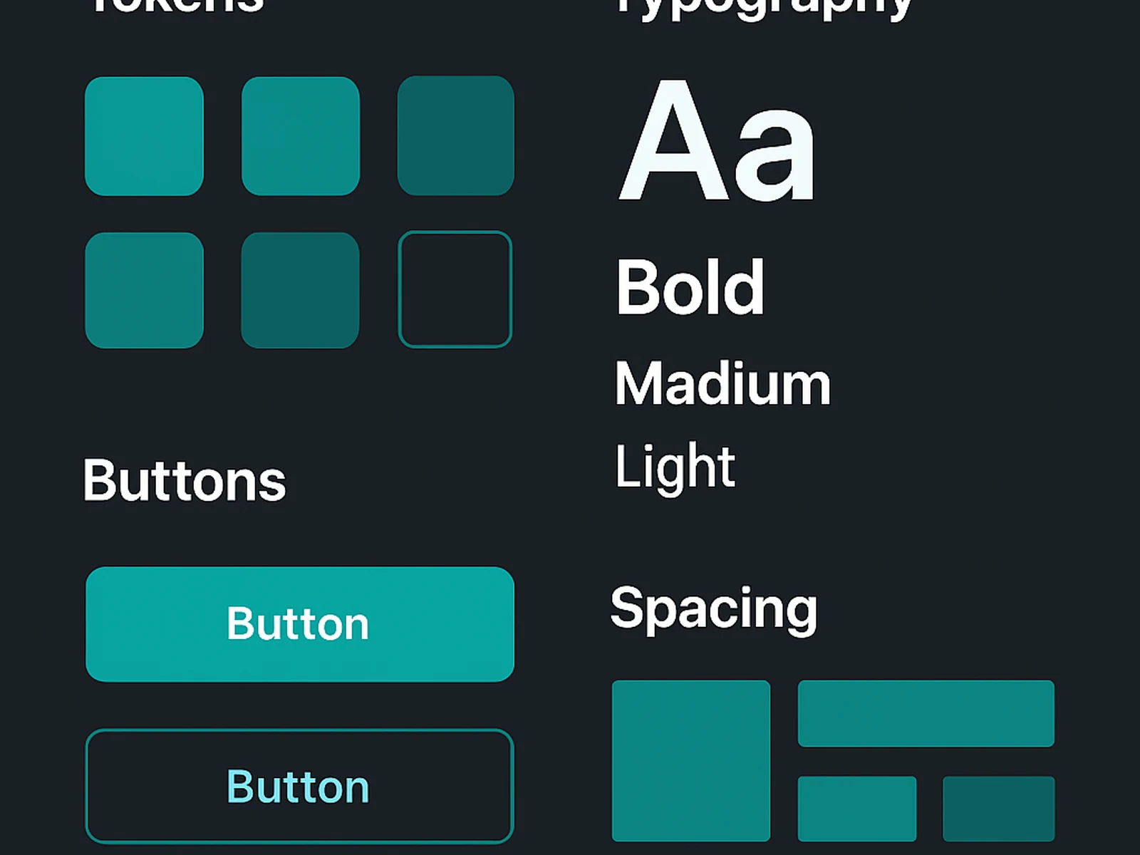
A design system defines the decisions that should not be made individually: colours, typography, spacing, components, and their variants. When the system is in place, teams can build faster because the small decisions are already made.
We build design systems in Figma using variables, auto-layout, and component properties. The system is documented so developers understand the rules. We work with your existing codebase to make sure the Figma system reflects what can actually be built.
For organisations that already have a product but no system, we start with an audit. We catalogue what exists, identify what is inconsistent, and produce a consolidation plan before writing a single component.
What is included
What a client says
"Building new features is noticeably faster now. The team is not reinventing components with every sprint."